Brownstein
Brand Identity | Web Design | Social Media
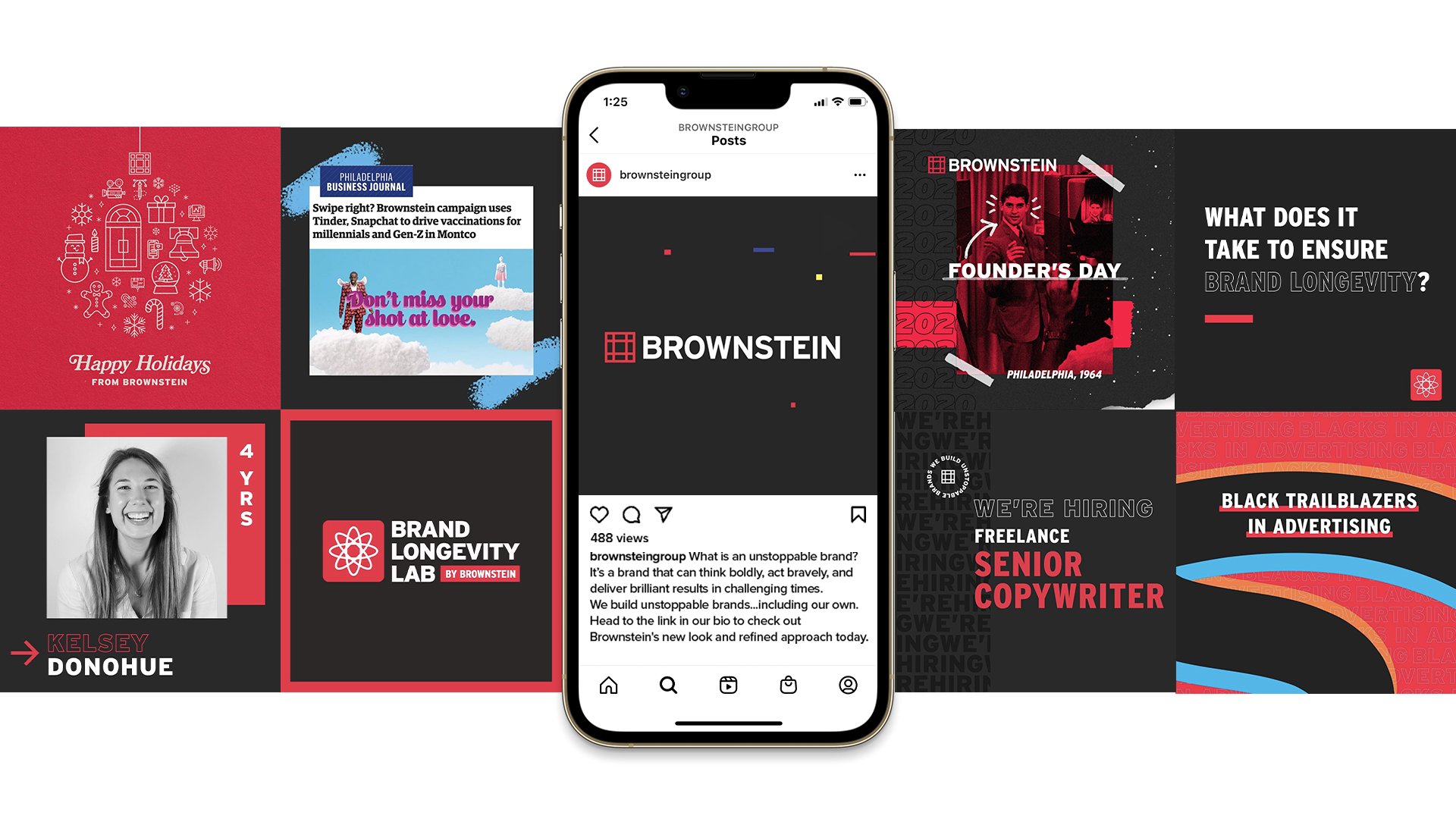
Brownstein’s refreshed identity sharpens the edges of key elements from across the history of the agency, finding ways to both remember the past and prepare for the future.
A brand in charge of making and shaping other brands has to work in concert with all kinds of graphics and styles. Therefore, our new look exists in a kaleidoscopic universe of secondary color combinations and variations. It is a canvas from which other brands are made. Nonetheless, Brownstein’s primary colors — red, black, and charcoal gray — still pay homage to our iconic door at 215 Broad in the heart of Philadelphia.
The agency’s new crossroads symbol, which retains the iconic nine-square form of recent brand iterations, takes on a new meaning. The new symbol is a versatile representation of the crossroads moment: where brands make the decisions that will carry them forward into the future.
Visit the new website here.
Client: Brownstein
Design: Matt Rondos
Creative Direction: Michelle Ventriglia
Copy: Scott Cirlin
Website Development: Will Murdoch
Animation: Lee Woolhiser
Agency: Brownstein


